
The Power of Charts: Visualizing Data for Clarity and Insight
Charts are powerful tools that play a crucial role in transforming raw data into meaningful insights. Whether you’re analyzing trends, comparing values, or presenting information, charts offer a visual representation that simplifies complex data sets.
Types of Charts
There are various types of charts, each designed to serve a specific purpose:
- Bar Chart: Ideal for comparing categories of data.
- Line Chart: Shows trends over time or continuous data.
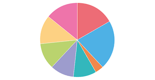
- Pie Chart: Illustrates proportions and percentages.
- Area Chart: Displays cumulative totals over time.
- Scatter Plot: Reveals relationships between variables.
The Benefits of Using Charts
Charts offer several advantages when it comes to data analysis and presentation:
- Clarity: Charts provide a clear visual representation of data, making it easier to interpret and understand complex information.
- Trends Identification: By plotting data points on a chart, trends and patterns become more apparent, aiding in decision-making processes.
- Comparison: Charts allow for easy comparison between different sets of data, highlighting similarities and differences effectively.
- Data Visualization: Visualizing data through charts enhances storytelling and engages the audience more effectively than raw numbers or text alone.
Tips for Creating Effective Charts
To ensure your charts are impactful and informative, consider the following tips:
- Select the Right Type: Choose a chart type that best suits your data and the message you want to convey.
- Simplify Design: Avoid cluttering your chart with unnecessary elements. Keep it clean and easy to read.
- Use Colors Wisely: Color can enhance readability but be mindful not to overwhelm with too many colors or shades.
- Add Context: Provide titles, labels, legends, and annotations to give context to your chart and guide interpretation.
In Conclusion
In an era where data is abundant but attention spans are limited, charts serve as invaluable tools for communicating insights effectively. Whether you’re presenting findings in a boardroom or analyzing trends for research purposes, harnessing the power of charts can elevate your data analysis game and enhance decision-making processes.
8 Essential Tips for Creating Effective and Clear Charts
- Choose the right type of chart for your data and message
- Keep it simple and avoid clutter
- Use appropriate colors to enhance readability
- Label your axes clearly and provide a title for the chart
- Ensure consistency in style across multiple charts in a presentation
- Utilize white space effectively to improve visual appeal
- Consider the audience when designing the chart for better understanding
- Use legends or annotations to explain any complex elements
Choose the right type of chart for your data and message
Selecting the appropriate type of chart for your data and intended message is a crucial step in effective data visualization. The choice of chart can significantly impact how easily your audience can interpret the information presented. By matching the characteristics of your data with the most suitable chart type, you can ensure clarity, accuracy, and relevance in conveying your message. Whether it’s a bar chart for comparing categories, a line chart for showing trends over time, or a pie chart for illustrating proportions, choosing the right chart type sets the foundation for clear and insightful data communication.
Keep it simple and avoid clutter
When creating charts, it is essential to adhere to the principle of simplicity and avoid clutter. By keeping the design clean and uncluttered, you ensure that the focus remains on the data itself, making it easier for viewers to interpret the information presented. A clutter-free chart not only enhances readability but also facilitates a quick understanding of key insights without distractions, ultimately leading to more effective communication of data-driven messages.
Use appropriate colors to enhance readability
Using appropriate colors to enhance readability in charts is essential for ensuring that data is easily understood and visually appealing. By selecting a color scheme that provides clear contrast and harmony, important data points can be emphasized while maintaining overall coherence. Avoiding overly bright or clashing colors helps prevent distractions and allows viewers to focus on the information being presented. Thoughtful color choices not only improve comprehension but also contribute to the overall aesthetics of the chart, making it more engaging and professional.
Label your axes clearly and provide a title for the chart
When creating charts, it is essential to label your axes clearly and provide a descriptive title for the chart. Clear axis labels help viewers understand the data being presented and the scale of measurement, ensuring accurate interpretation. Additionally, a well-crafted title provides context and guides the audience on what information the chart conveys, enhancing overall comprehension and making the chart more informative and impactful. By following this tip, you can effectively communicate your data insights and facilitate better decision-making based on the visual representation provided by the chart.
Ensure consistency in style across multiple charts in a presentation
Ensuring consistency in style across multiple charts in a presentation is essential for maintaining visual coherence and facilitating easier comprehension for the audience. By using consistent colors, fonts, labeling conventions, and chart types throughout the presentation, you create a cohesive visual narrative that helps viewers focus on the data itself rather than being distracted by varying design elements. This approach not only enhances the professional look of the presentation but also reinforces key messages and ensures that comparisons between different charts are more intuitive and meaningful. Consistency in style ultimately contributes to a smoother flow of information and a more impactful delivery of insights.
Utilize white space effectively to improve visual appeal
Utilizing white space effectively in charts is a key strategy to improve visual appeal and enhance readability. By incorporating adequate spacing between elements, such as data points, labels, and axes, you can prevent visual clutter and allow the viewer’s eyes to focus on the essential information. White space not only creates a sense of balance and harmony in the chart but also guides the viewer’s attention to the most critical data points, making the overall presentation more aesthetically pleasing and easier to comprehend.
Consider the audience when designing the chart for better understanding
When designing a chart, it is essential to consider the audience to ensure better understanding and engagement. Tailoring the chart’s design, complexity, and level of detail to match the audience’s knowledge and preferences can significantly enhance the effectiveness of conveying information. By keeping the audience in mind, you can create charts that resonate with them, making data interpretation more accessible and impactful.
Use legends or annotations to explain any complex elements
In the realm of chart design, utilizing legends or annotations to elucidate intricate components proves to be a valuable practice. By incorporating clear legends or annotations, viewers can easily grasp the meaning of complex elements within the chart, enhancing comprehension and ensuring that key information is effectively communicated. This thoughtful approach not only simplifies data interpretation but also adds depth and clarity to the overall visual presentation, making charts more accessible and insightful for audiences of varying levels of expertise.